Bounty was looking to refresh the packaging and towel designs for their line of prints. My team was tasked with revamping the package designs to help them stand out on the shelf, particularly for the prints consumers, as there was a challenge distinguishing between the prints and the parent products.
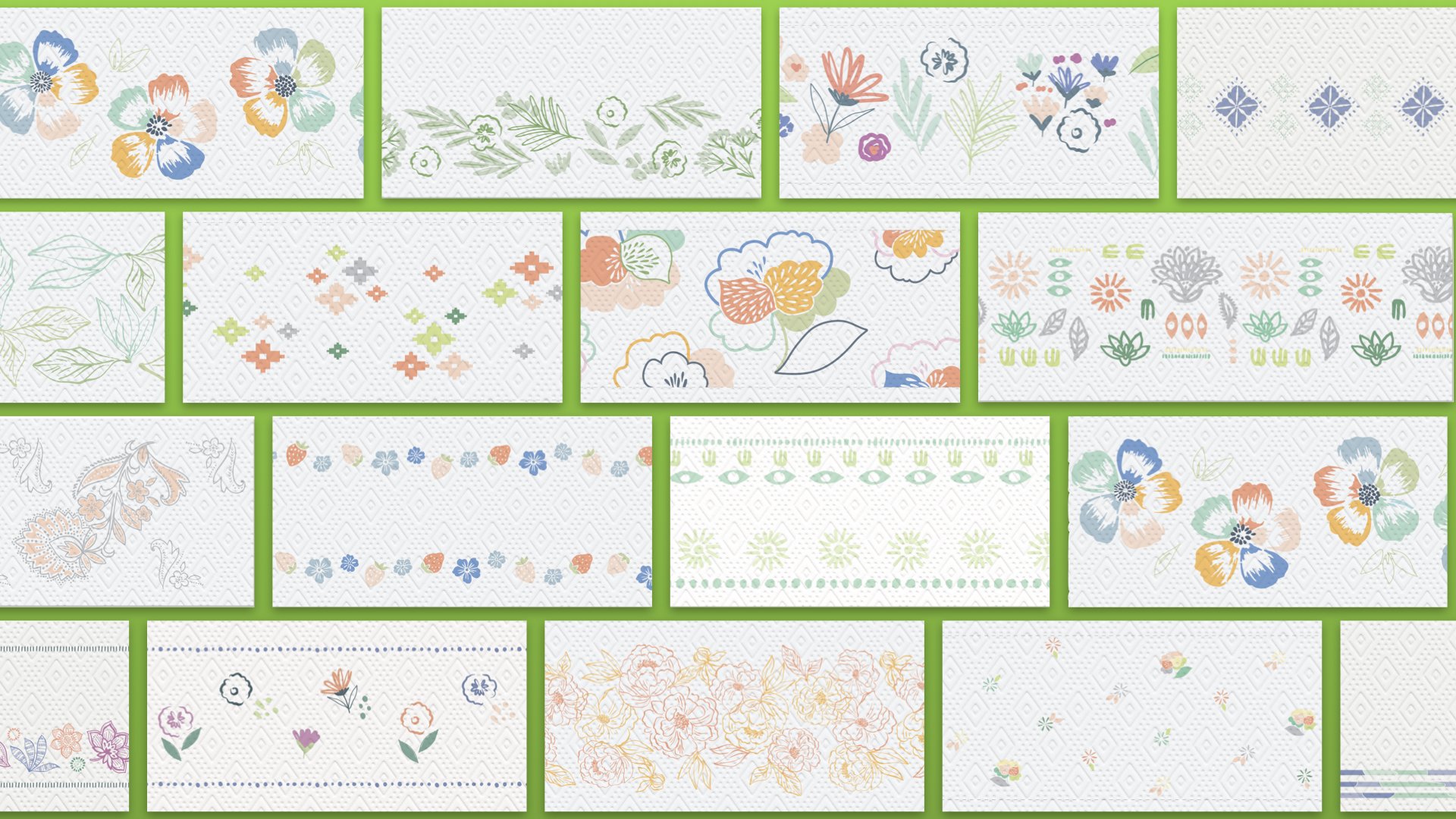
For the towel prints, we explored a variety of patterns, ranging from minimal coverage and subtle color usage to bold designs with vibrant color and full coverage. Through research and testing, we identified the winning patterns and color palettes that resonated best with the prints consumer. Our initial testing started with over 60 designs, narrowed down to 6 winning designs. This project went so well we were asked to do the same exercise for Puffs Everyday packaging and LCPs.
Above is a small example of the range of exploratory of patterns that were put into testing to see what resonated with consumers.
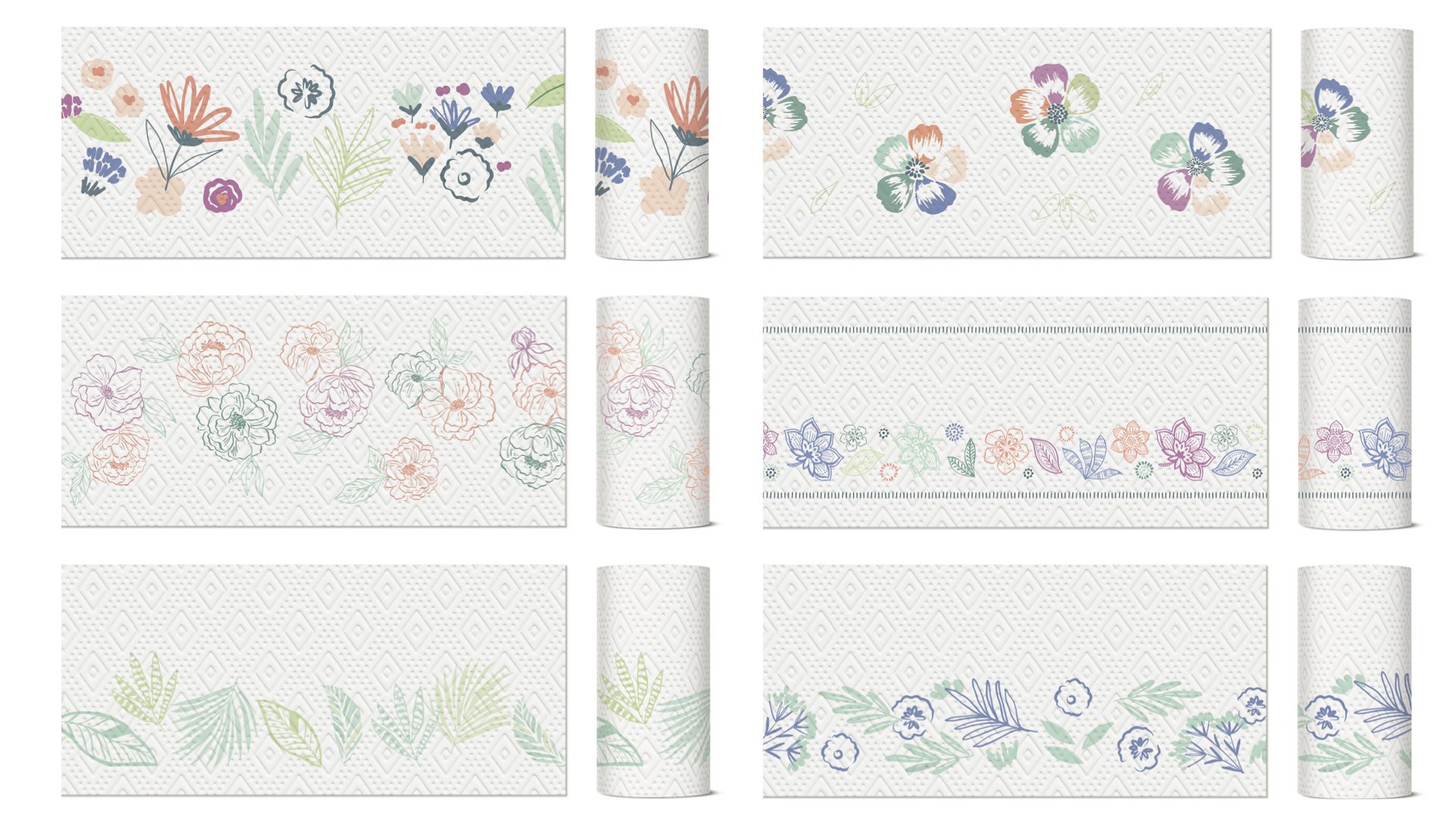
Below is the final selection of prints and colorway for the collection.
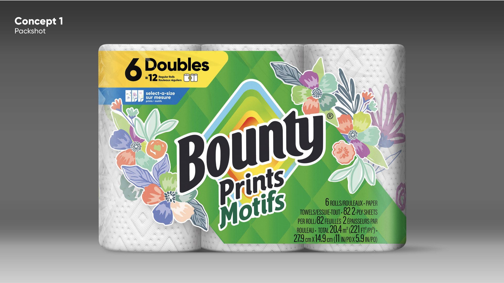
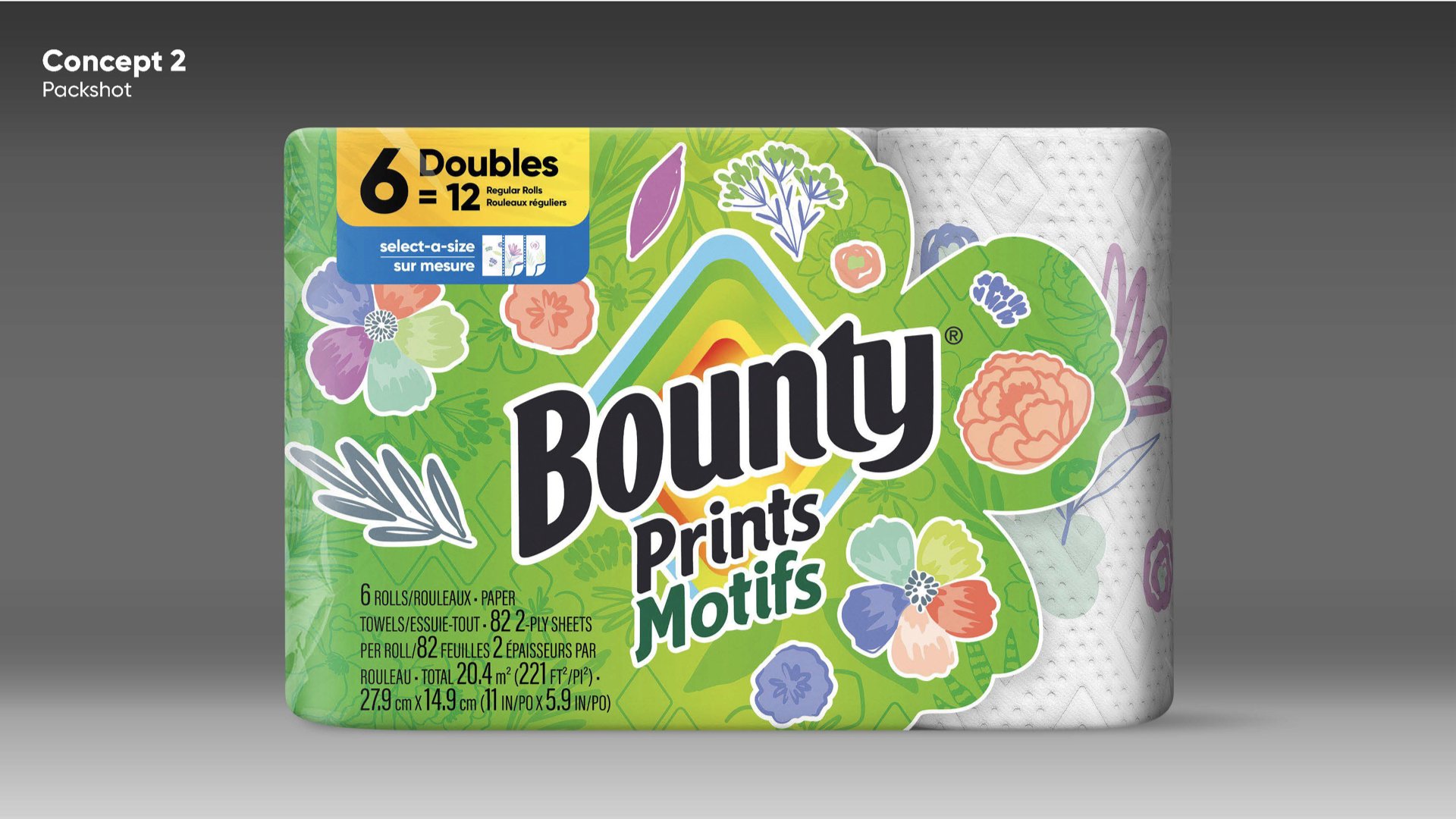
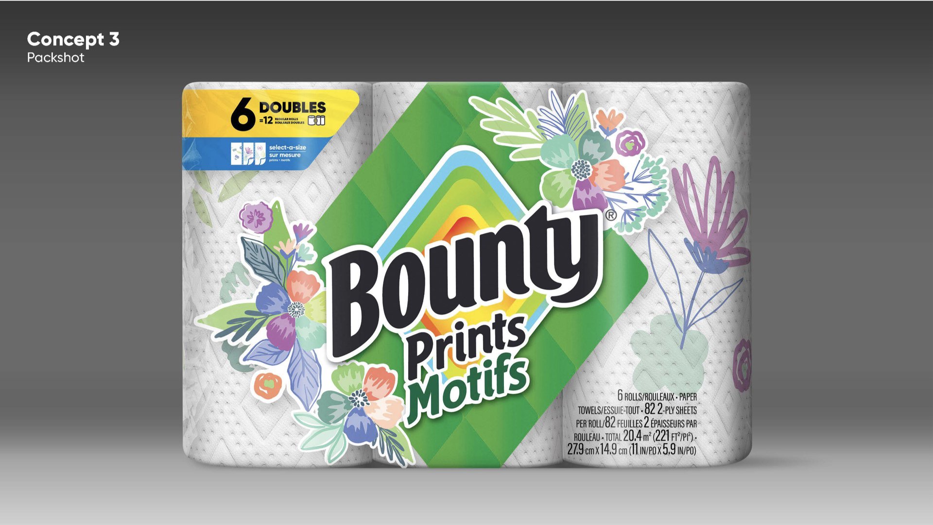
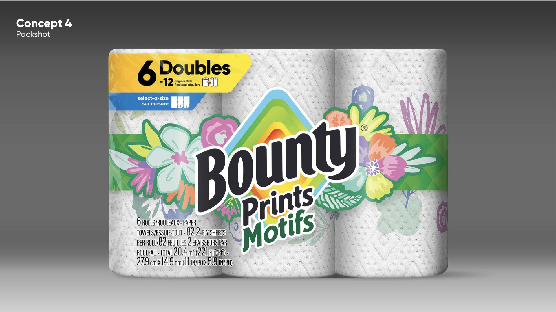
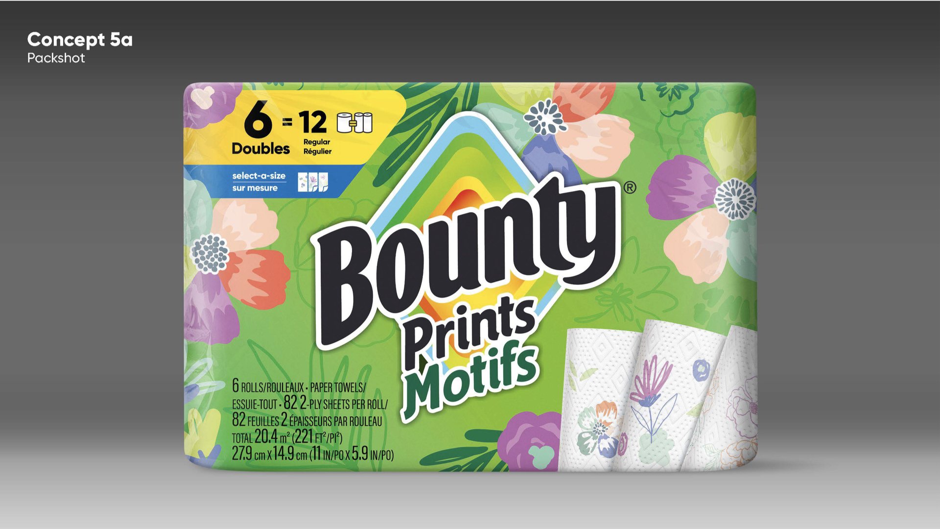
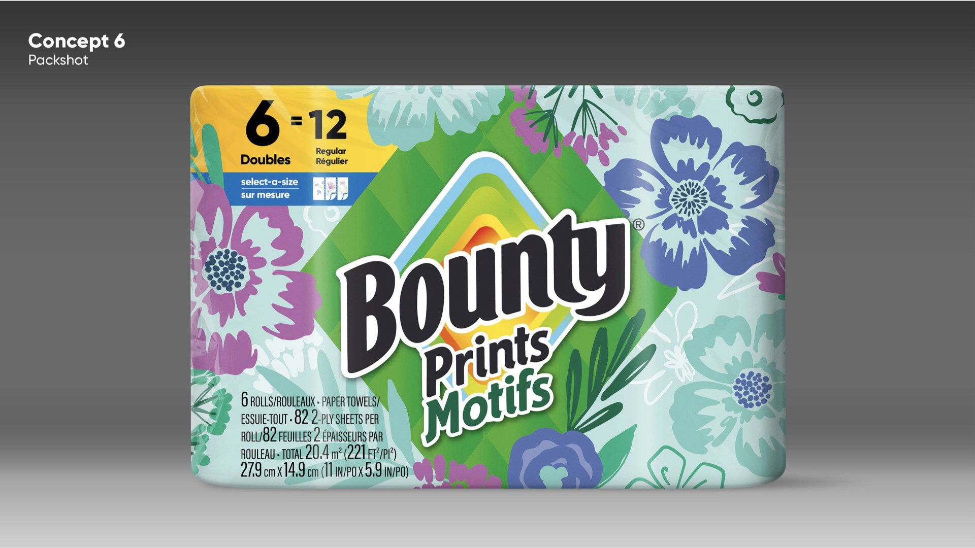
Below is the exploratory for packaging that was inspired by the winning towel prints. I explored a range of designs that were close-in to current and looked at a variety of solutions to help it stand out on shelf. Everything from using minimal amounts of the equity Bounty green all the way to leaning heavily into showcasing the prints. the final chosen design was a slight variation of concept 3.