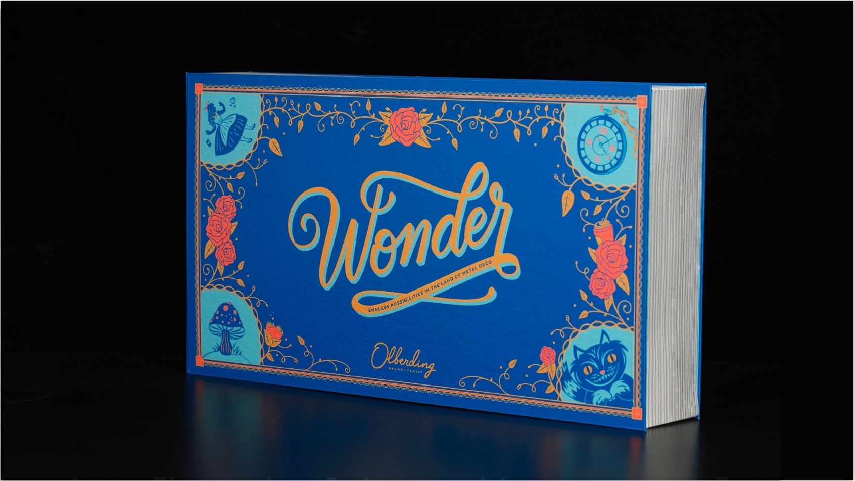

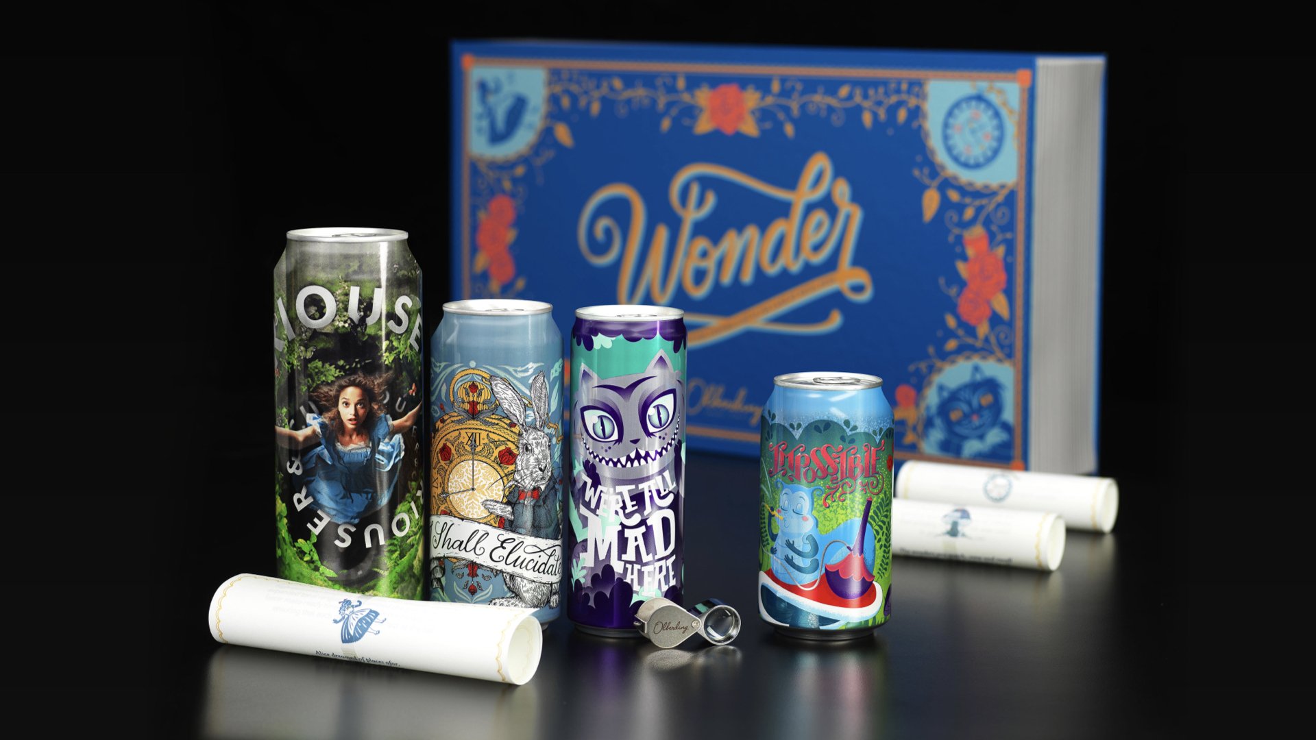
Collaborating with our Marketing and Sales teams, I led and designed a dynamic sales kit to inspire and challenge both current and potential clients in our Metal Decorating business, showcasing innovative approaches to working with metal deco.
The goal was to spark curiosity, initiate conversations, and generate excitement about the possibilities we offer in tackling the challenges of printing on cans.
I partnered with various departments across the company, from concept development and storytelling to separations and production, working closely with the team to create a sales kit that pushes the boundaries of the industry.
I aimed to empower the sales team to guide clients through a narrative that would reveal how seemingly impossible tasks in metal deco become achievable when they partner with us.
Inspired by the concept of Alice in Wonderland and "falling down the rabbit hole," we used the story to illustrate the incredible possibilities that unfold when you collaborate with a company that masters design from concept to final product.
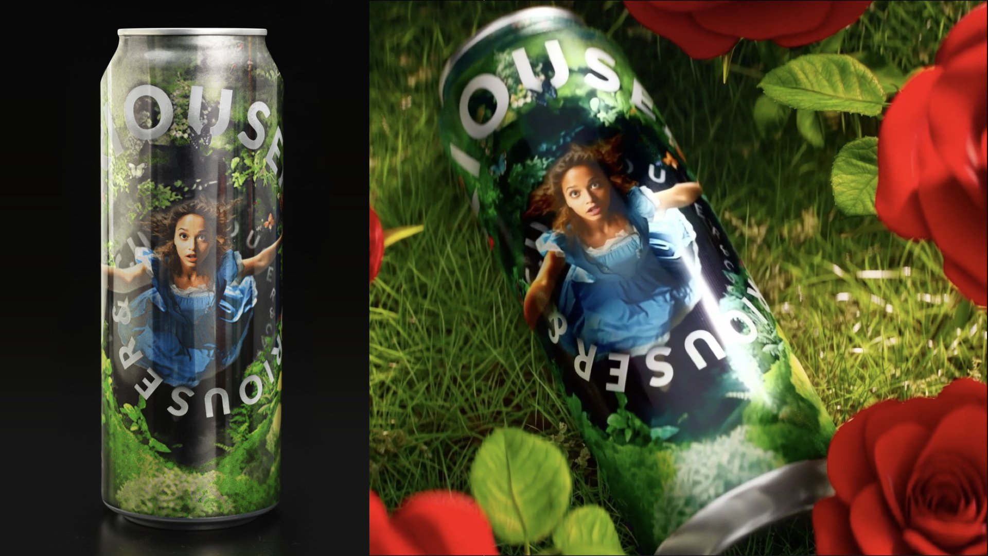
Alice
At the start of our story, we follow Alice as she falls down the rabbit hole. This concept allows us to showcase our expertise in producing continuous-tone, photo-real imagery, especially with dark complexions.
Using AI, we reimagined Alice as she descends into Wonderland, pushing the boundaries of detail and photo-realistic photography. The can, displayed on the left, showcases the final product, while the image on the right is a still from a 3D CGI video.
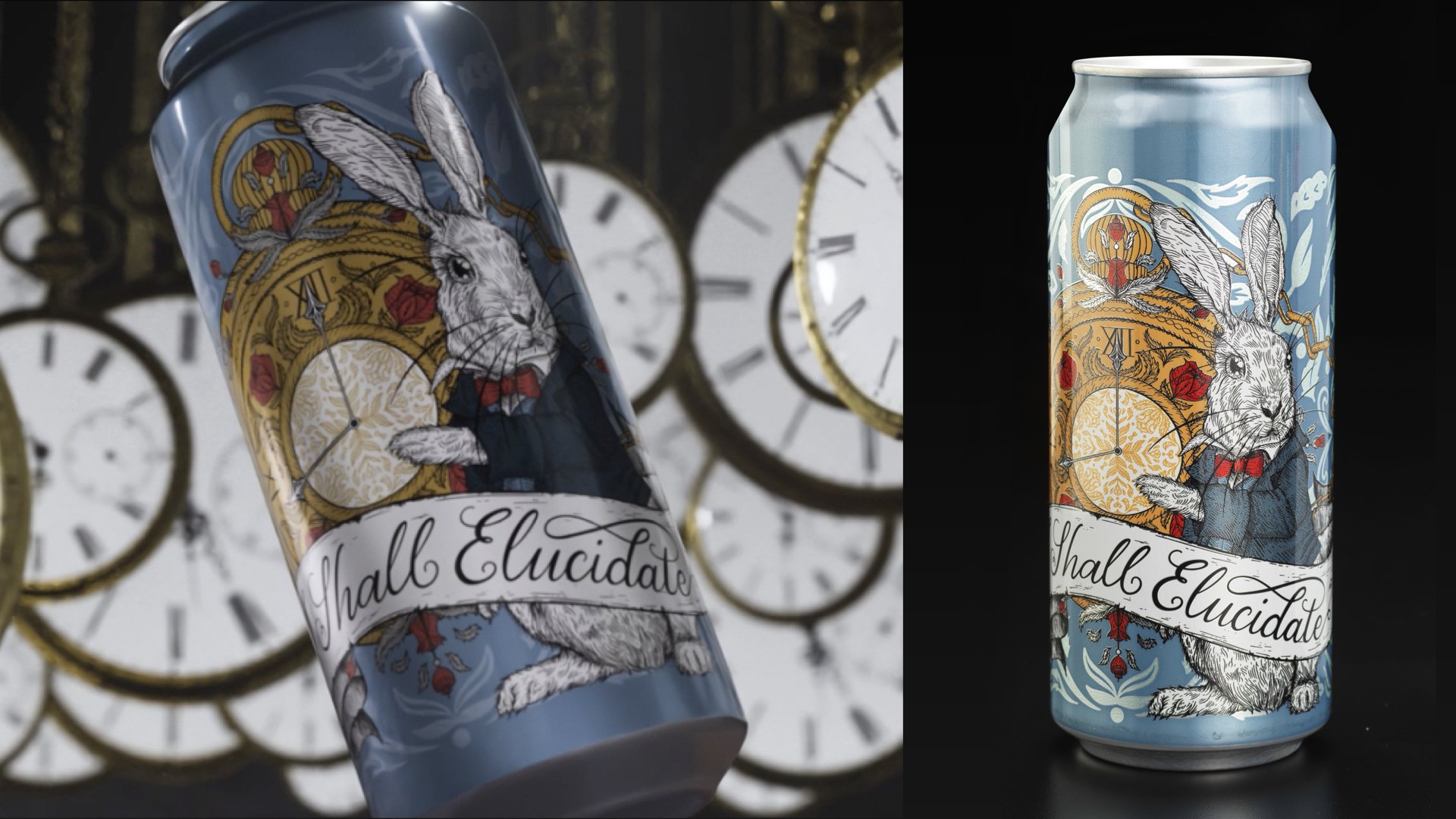
The White Rabbit
As our journey continued, we followed the White Rabbit. This can was designed to demonstrate our ability to capture intricate lines and details in metal deco printing.
For this design, I focused on the fine textures of the rabbit’s fur and the ornate details of his pocket watch, highlighting our capability to maintain precise lines without ink
cross-contamination, while preserving the sharpness and
clarity of every detail. A photo of the produced can is on the right and 3D CGI still on the left.
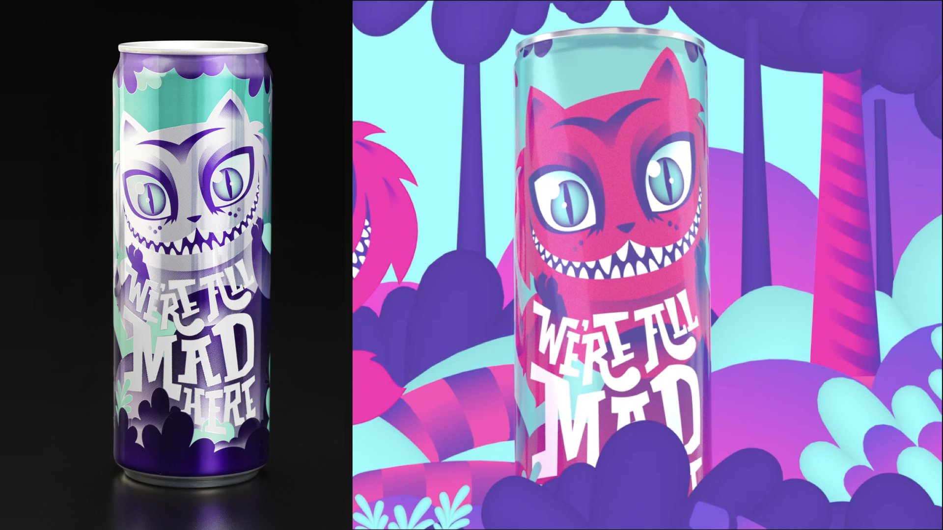
The Cheshire Cat
Next, we encounter the Cheshire Cat and his mischievous charm. This can’s design leverages temperature-sensitive inks and gradients— a challenging technique in metal deco due to the sharp transitions where two gradients overlap.
In this design, I aimed to emphasize the playful nature of inks that appear and disappear, a feature often overlooked in the CPG space. I wanted to make this element a central part of the story, bringing both the design and narrative to life. The image on the left shows the produced can at room temperature, while the image on the right is a 3D CGI still of the can in its cold state.
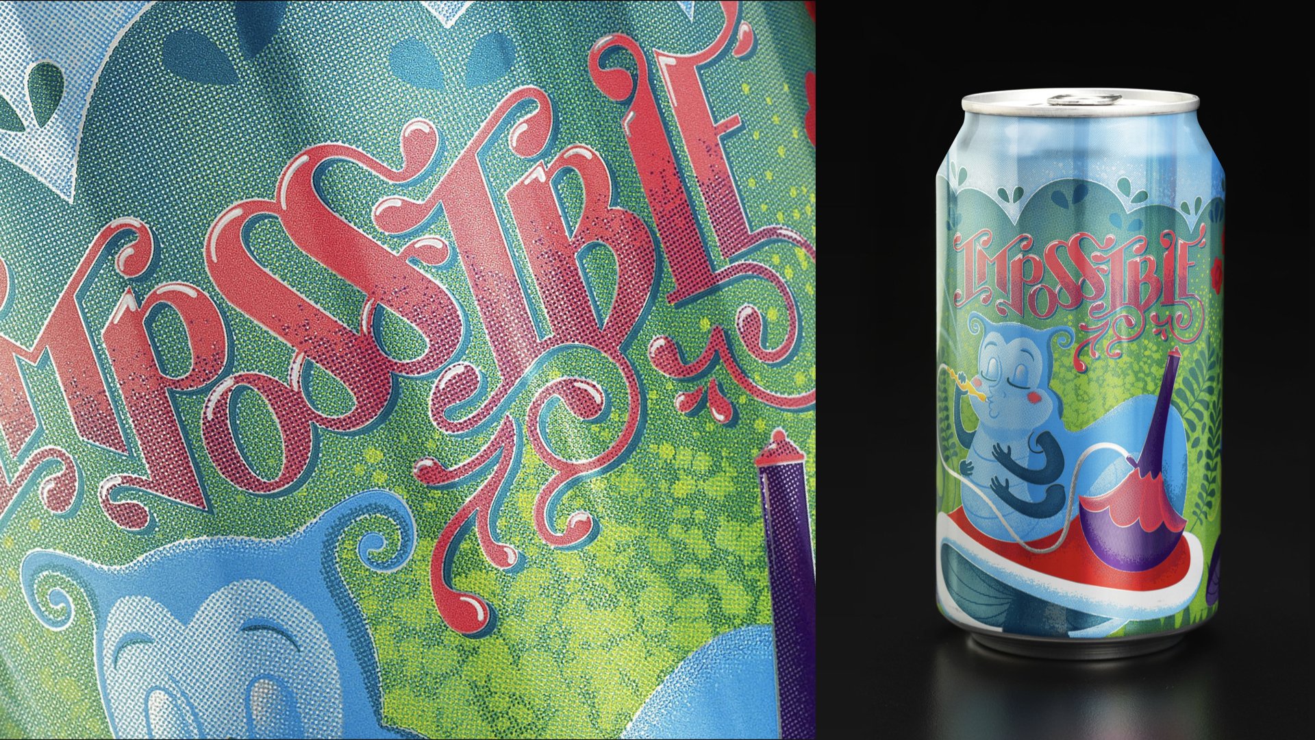
The Caterpillar
As the story concludes, our friend the caterpillar demonstrates that nothing is impossible. In this design, we pushed the limits of six ink stations to create the illusion of using more than six inks. Since inks in metal deco cannot mix, we had to print in distinct spots without overlapping.
Can you believe there’s no dedicated green ink station on this can? I challenged the boundaries of reality by using the yellow and blue ink stations placed close together, allowing the eye to perceive the illusion of green.
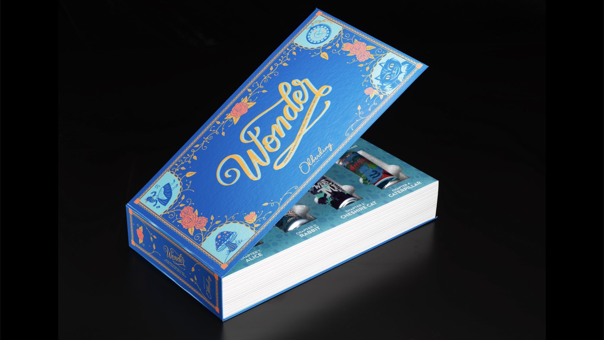
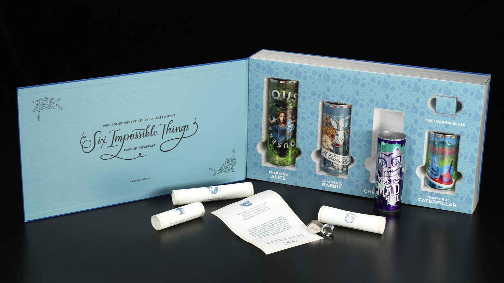
The Full Kit
Each can was presented within a storybook, accompanied by scrolls inside to highlight the unique elements of the story and the challenges associated with each design.